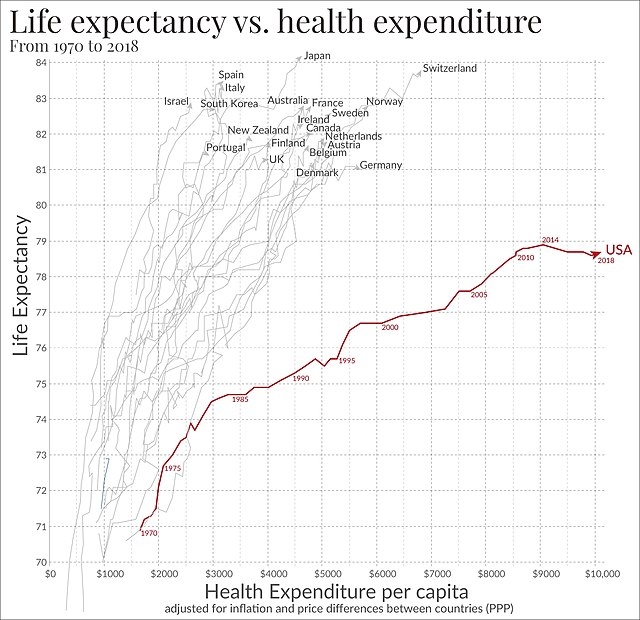
That was the graph that opened my eyes a bit back in another discussion. I knew that people were dying in the States because they can't afford insulin/medication/treatment. But I somehow thought they were at least paying less for healthcare and just poor and society didn't care about people in need. But it's way worse. They are dying 2 years earlier WHILE paying twice as much for healthcare. And ruined financially if anything happens to them or their loved ones.
And all of that is a scheme to rip off everyone. Sadly a quite successful scheme for decades already. I mean I'm really amazed by the extent. And I wonder if it were possible to adopt another style, give healthcare to everyone plus every citizen an additional $5.000 for free each year. I don't really see that happening though. Every government in the past decades, no matter their color, has contributed to keep that graph going in this direction.
Edit: And I'd like to see that diagram for a few other countries. Not just against Europe, Japan, Australia, Israel and Korea.

Nice. Does anyone have an idea if there's open source third-party clients for that? I don't have the Android Google services installed on my phone.