plz1

joined 2 years ago
[–] [email protected] 19 points 5 days ago (1 children)

I'm so happy with Voyager being a really good replacement for Apollo. If you use it, donate to the dev. Building apps this good, solo, is hard.

[–] [email protected] 11 points 5 days ago

I always see them posts-in, so the outward appearance (to the street, etc.) is nice. Curb appeal. Also to make it harder to climb.

[–] [email protected] 17 points 1 week ago (5 children)

OK, so...

I've seen article headlines noting both a British journalist and Australian journalist. My question is, are these discrepancies just examples of bad reporting, or are they targeting foreign journalists and both headlines are accurate??

[–] [email protected] 6 points 1 week ago

AI crawlers ignore robots.txt. The only way to get them to stop is with active counter measures.

[–] [email protected] 15 points 1 week ago

Well, the quote is from a district attorney, so they are pushing their narrative.

[–] [email protected] 21 points 1 week ago (3 children)

It can and likely is both.

[–] [email protected] 13 points 1 week ago

Signal is E2EE. While it does use notifications, there is no meaningful unencrypted content in them. The content of the notification you see is decrypted on-device.

[–] [email protected] 94 points 1 week ago (1 children)

Samsung's board of directors. Of which half are probably using iPhones.

[–] [email protected] 1 points 2 weeks ago (1 children)

Don't worry, that's all written by defense contractors anyways, so they'll sell it to the US, and to others the US allows, all closed source. The source won't even be open to the US government, either, as that'd harm the bottom line of the contractor (support & maintenance contracts for that closed-source software).

[–] [email protected] 6 points 2 weeks ago (5 children)

Yeah, like, his fascism jubilee isn't going to be in Chicago, so this article is just hunting for clicks.

[–] [email protected] 10 points 2 weeks ago (1 children)

Queue the AI-generated memes of Winnie the Pooh eating tacos...
[–] [email protected] 5 points 2 weeks ago (2 children)

Paintball gun?


I think this community is appropriate for this topic, since this solution is being rolled out to combat AI scraping of websites.

I don't really understand why the collective agreement is "it is better than captchas would be", when you didn't need to pass a captcha just to view a website in the first place. Why are people not more pissed off about every website suddenly requiring this laggy, sometimes actually a captcha anyways (checkbox to prove you are human) solution slowing down visits to websites?

And why can't CloudFlare offer some way for us lowly non-AI's to prove we're human, once, for our entire web experience, versus on. every. damned. website. one. at. a. time?

I counted, and I hit this turnstile solution on 28 website visits today, and sometimes more than once on the same site. That's minutes of my life I don't get back, and likely hours to days over the course of a year.

There has to be a better way...

/rant


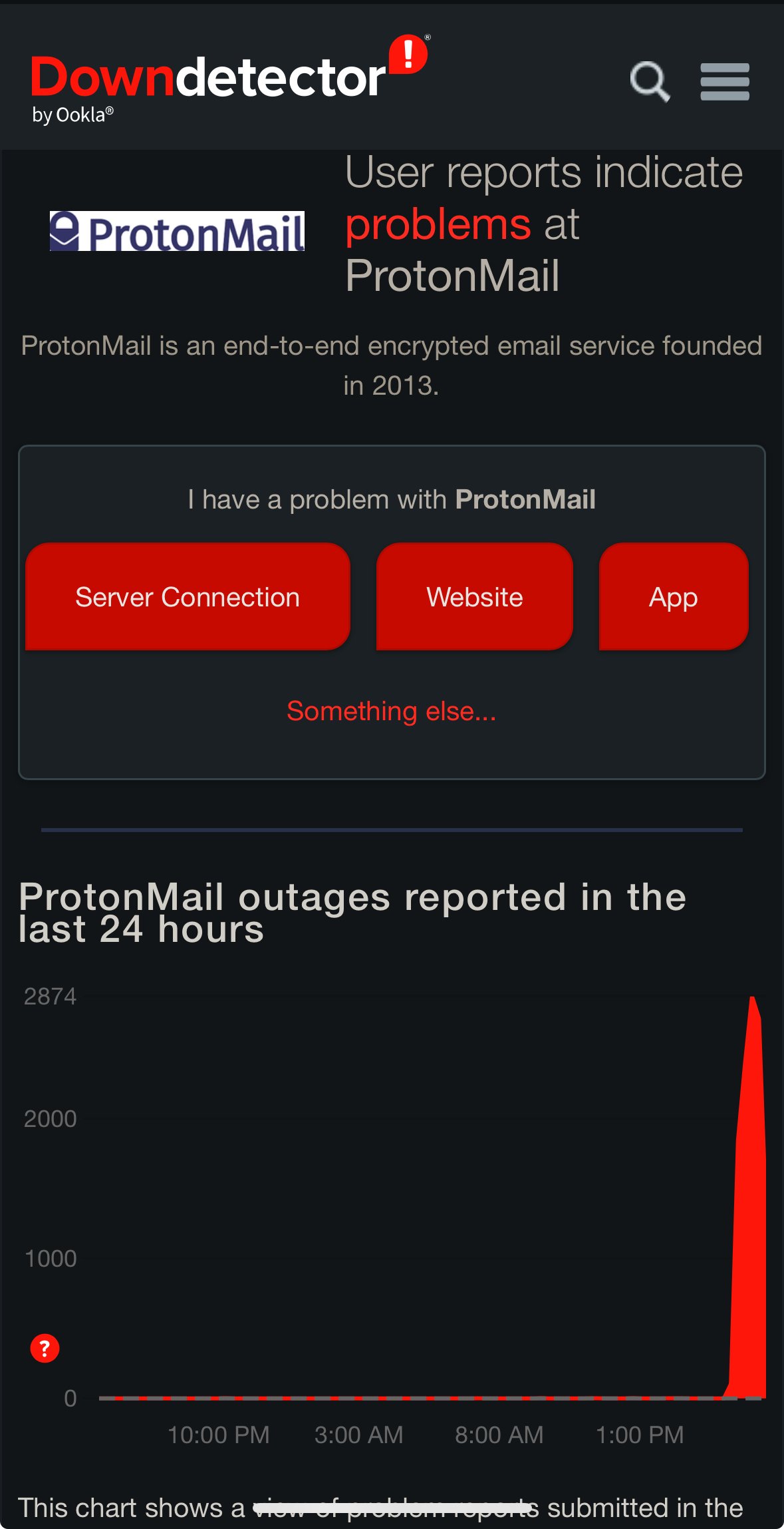
Been down for a couple hours for me.


For me, it's a light grey color and the text is white, even when CarPlay is set to always use dark mode. This is hard for me to read, but I can't find any way to change this. I'd rather just have an actual dark background when in dark mode.


For folks using multiple accounts, it feels a bit buried to go from content in one to the other. It would be nice if the number of taps to go between different accounts was reduced by a few.


I don’t know if this is the app, instance issues, or both, but I’ve found this feature to not work well


I think it would be cool to be able to swipe left/right when viewing an image post from the feed or in a community and be able to go from post to post like a slideshow.


Reproduced in latest release today. When I swipe left on a comment in Inbox to reply to it, it just hides it. If I go to the All view and re-swipe left, it'll open the reply dialog. So it appears to only be a bug if you have the view set to Unread.


Build 72 seems to be the nail in the coffin for font scaling. All text is tiny now. It's there any plan to support accessibility?


Some communities will have a deluge of posts, which tend to astroturf the main feed. I loved the feature in Apollo that let us mark a sub as a favorite to make it easy to get to, without subscribing to it and having it hit the main feed.


Can we get the option to put the voting buttons on the left? Also, view on ipad is truncating the titles when there is plenty of room.

1
submitted 2 years ago* (last edited 2 years ago) by [email protected] to c/[email protected]
 

When the app launches fresh, it seems to default to All instead of what I had before (Subscribed).

EDIT: I just found the setting for this. I don't recall seeing it before, but happy it's there!


In dark mode, when viewing the voting buttons, could we get higher-contrast coloring when a post is voted on? The upvote coloring is nearly impossible for me to distinguish from the default un-voted color (light blue vs. grey). I'm using the darkly theme, but darkly red has the same challenge. Using browser extensions to override this is only an option for desktop-only usage.

Sincerely, a visually-challenged Reddit refugee.

view more: next ›