artist's artstation || [archived] website || [archived] weebly site

yes i know exactly what you mean…
yeah you did, don't worry
it was just a small semantic feature i happened to notice. i'm impressed you managed to get my meaning even though i apparently used the wrong phrase, though [edit: or possibly i didn't, i guess]
finally tywele, i've found something cutesy for you
sorry :(
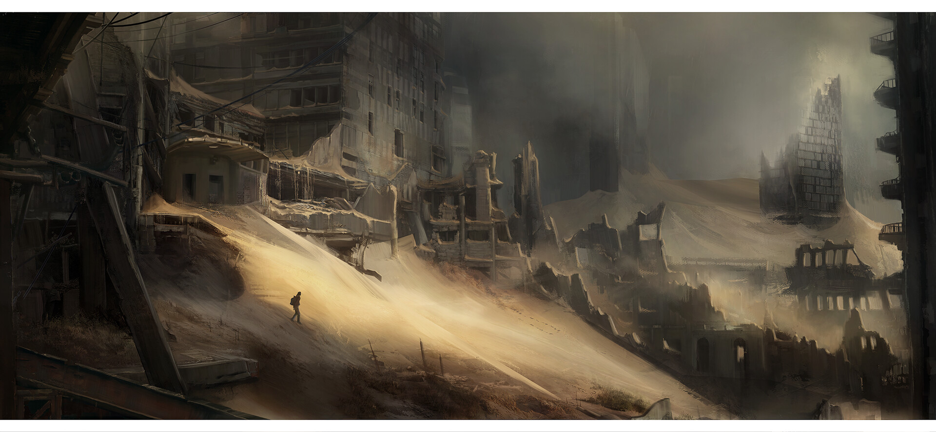
Judging if something is pre or post apocalyptic, while allowing abandoned stuff to be pre-apocalyptic, feels more difficult.
yeah that's fair, that's why i do accept it's conjecture. i just go by the kind of "feeling" of the piece, but i know that isn't exactly something you can use
i've also just noticed i used "built from scratch" and "scratch-built" as opposites in that comment, which i imagine also isn't hugely helpful..
fair enough, it is conjecture either way
perhaps pre-apocalyptic vs post-apocalyptic is a better distinguisher? and i'd say this looks pre; but it could be recently post and the electricity's still running. so i won't fault you for being confused
i mean there could be people in a wasteland (exempli gratia) even though it's clearly post-apocalyptic, so i guess that was bad advice to give you
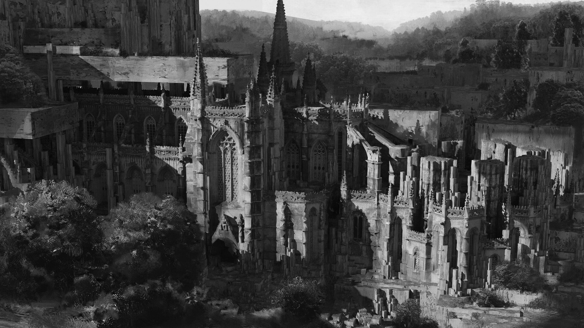
ah see now this one i personally would have put in !imaginarydegradation
it's not unsuited to here, but to me it looks more dilapidated than abandoned^?^
ah, that makes sense
although they've both chosen almost exactly the same camera angle, too
i do slightly prefer this one though, i like the cyrillic and led readout (also i appreciate that you've chosen the nicer lighting of the two from this post)
i think it depends
i mean it looks shitty on my screenshot, but that's because it's a phone not a tablet. my eyes can move easier than my thumbs, so i'd rather glance than have to scroll twice as far
i disagree with empty space usually, but i don't disagree that it would be better filled with, say actionable buttons rather than text that needs to be read
¯\_(ツ)_/¯ i'd find it much better as it's more information dense. that's why apps have preferences.
but i was just pointing out that there's definitely a "sensible alternative"
until there's proper content warnings on lemmy, i'm using nsfw (for this sphere specifically) for any nazi insigniæ (see sidebar)
not because i think nazi insignia are particularly trigger-y; but because lemmy's pretty politically charged at the moment^[which is sad, because i'd love something like /r/propagandaposters; but i'm afeard it would turn into [email protected]], and i want it to be clear that this is not a pro-nazi space
artist's artstation || [archived] website || [archived] weebly site
(sort of feels like three titles to me..)
i don't really know much more about the artist though, as it's such a generic name
ahh, what an imaginative title…
artstation site || artstation page
artist's [dead] website || substack

website source (yes, it's an infinite scroll by js website; and it's almost at the end...)
but his art is also available at massiveblackworkshop and muddy colors
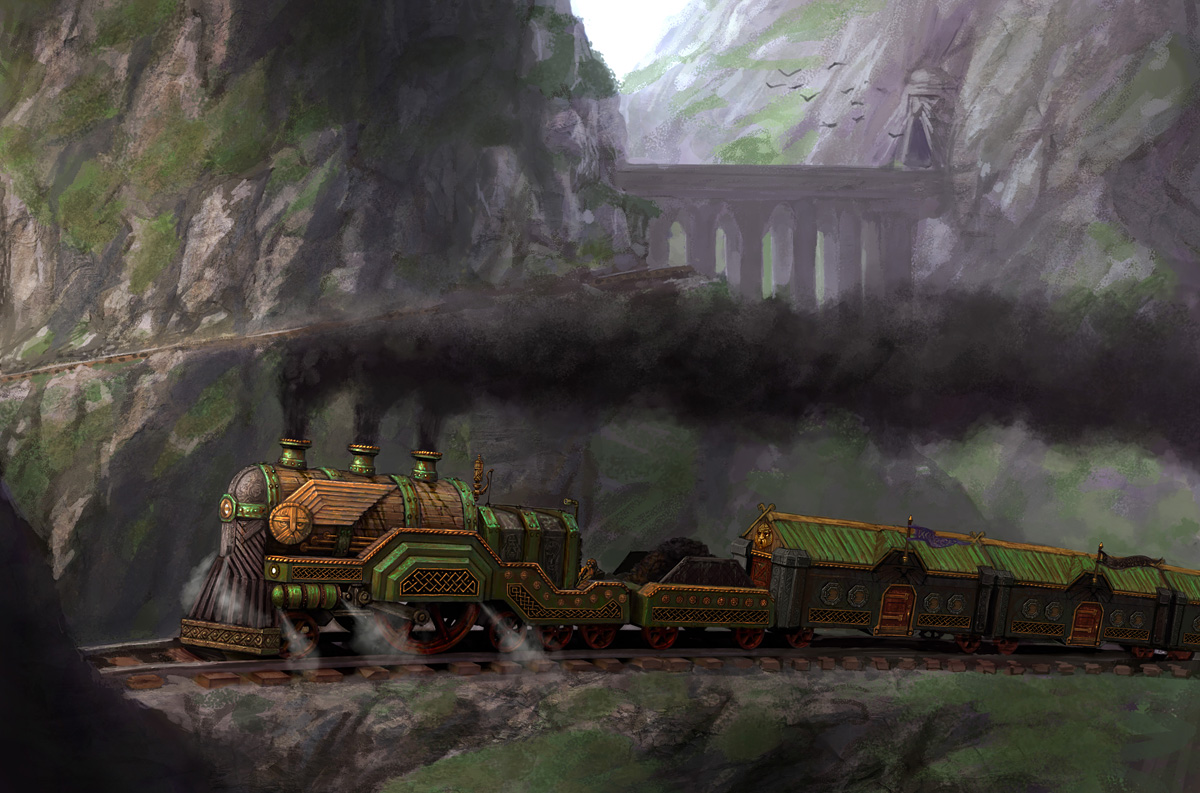
concept art for Warhammer Online (presumably age of reckoning)
i don't know why this piece stuck out to me -- i didn't even recognice it as warhammer actually -- but i like the little knot detailing and the little winglets on the sides of the boiler
now it's a bit buried on his site; but i'm pretty sure this is the actual source
artist's artstation site || artstation page
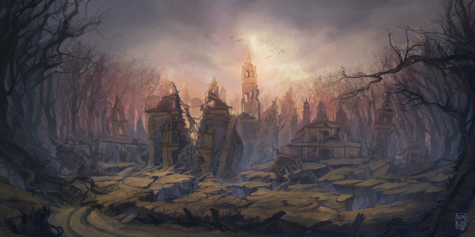
Desolation, concept art for Blasphemous
https://www.team17.com/games/blasphemous/
By Jesús Campos "Nerkin" 2018-2019
some concept art for Blasphemous (the holy line area, i believe), which is a fantastic game[^1] and i thoroughly recommend it to anyone who likes metroidvanias or souls-likes
artstation site || artstation page
[^1]: there's also a sequel but i haven't played that yet
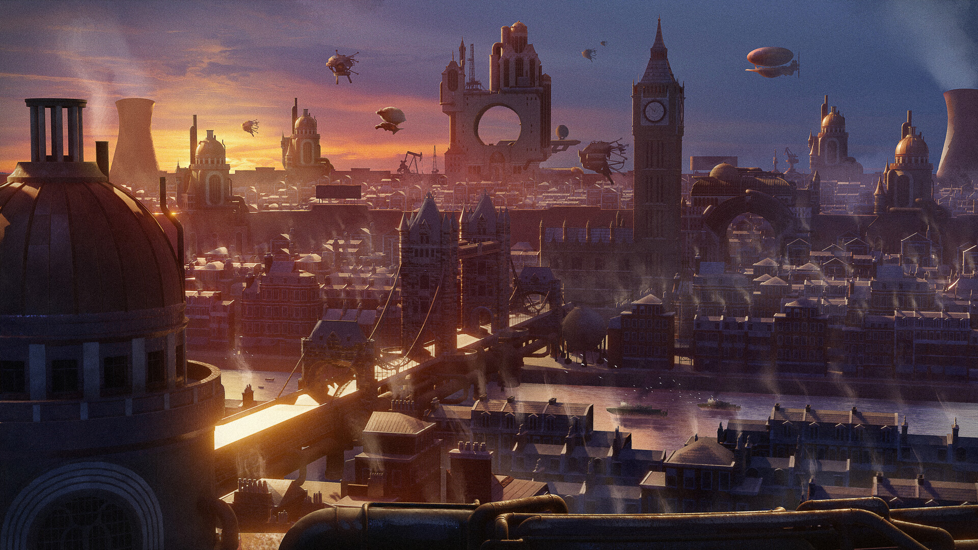
Hello everyone, once again I come to share another personal piece that I made to continue improving my skills. In this case, I've tried to reimagine what the city of London would be like taking inspiration from the Frostpunk aesthetic.
I hope you like it!
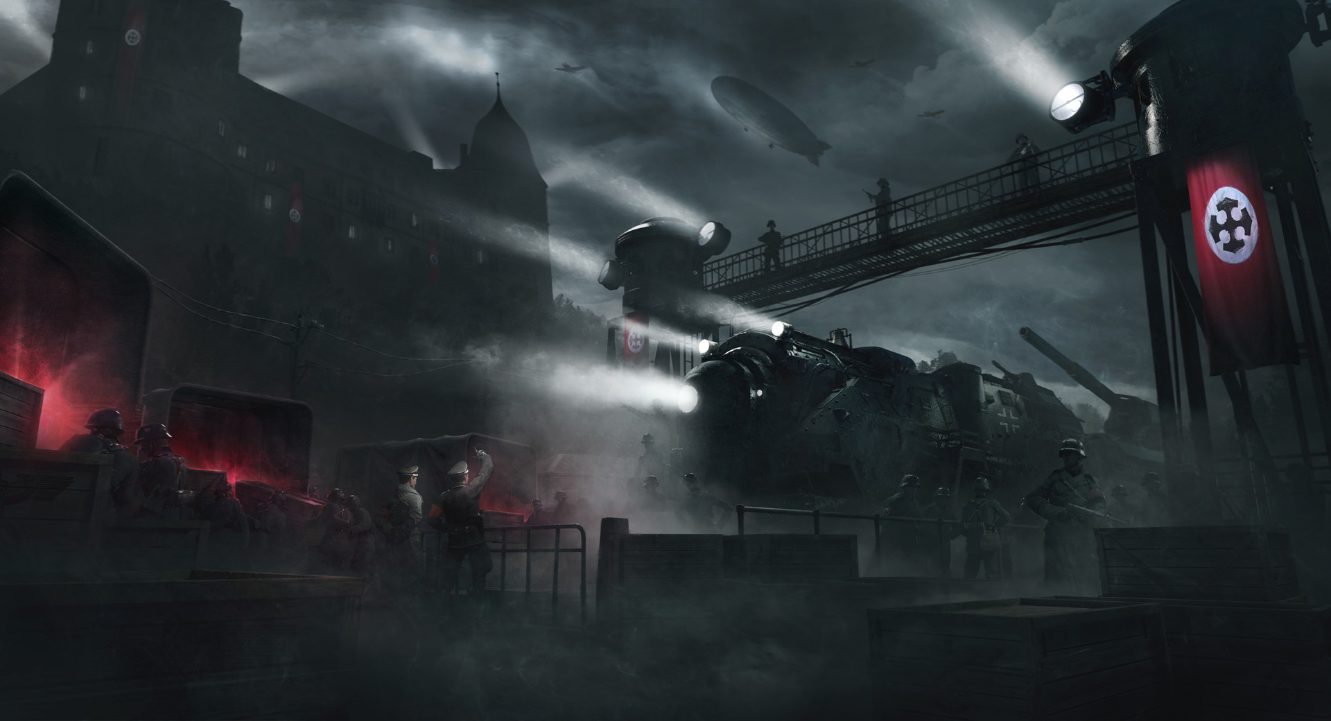
part of his "reich busters" series on his artstation (unfortunately the only one with a train in though…)
i love these giant starships within the atmosphere evidencing how large they are
used as the cover of a.e. van vogt's "the secret galactics" and justin leiber's "beyond humanity"; as well as various others


nice avatar by the way, i think that's possibly their best album