i don't know why he even has a wang tube to be honest
Zeus
joined 2 years ago
MODERATOR OF
d'you know what, i have no idea
i don't recognise it, but i could just not have been paying attention
sexy, isn't she
¯\_(ツ)_/¯ plenty of people like it.
either browse Subscribed or be prepared to block communities. do you post this under every sports team lemmysphere you don't support or city you don't live in?
i'm not doing it to "make Lemmy look more populated", i'm doing it because i liked them on reddit and want them here.
also there're about to be quite a few more (not made by me), so prepare yourself and your block button
oh this is so gorgeous! also it fits the title so well
i can't believe i actually follow this artist but i missed this piece?
i love the reflections! they're done really well with so few brushstrokes!
i know
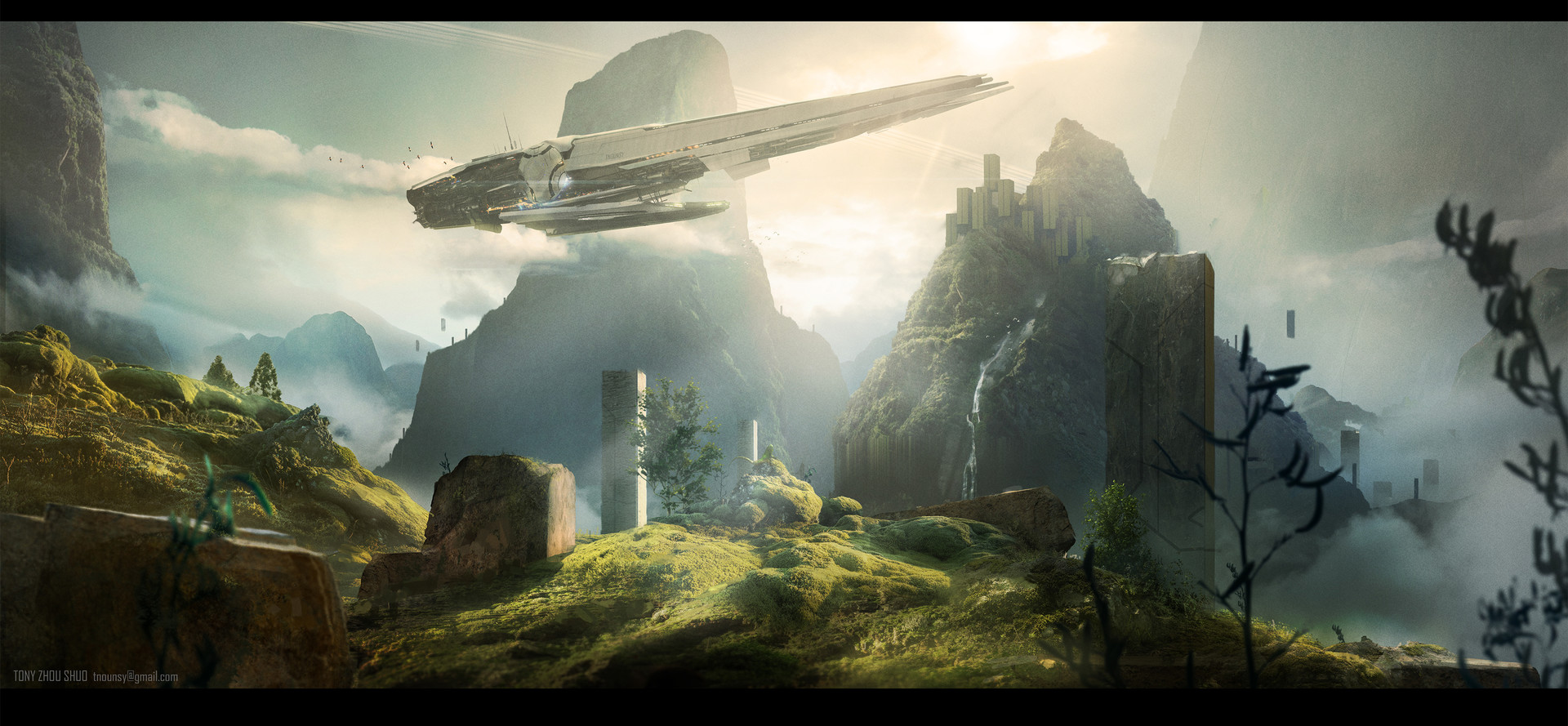
it's not that dieselpunkish, but the scale and composition were so cool i had to post it
i did hold off on posting it for a while actually because it's it's a bit potter-esque
but then i thought she doesn't have a copyright on round glasses; and why let arseholes ruin the context of nice art
i mean, i guess it is technically an art piece so it scrapes by. and also because there's currently no better lemmysphere for it and it's cool
but i don't think it'd wash in, say, !imaginarywastelands
As others have said, it’s up to you to decide.
no-one has said that but you (unless you mean martineski; and i tend to do the opposite of anything he says)
thank tywele not me!
but if you like this, i feel duty bound to promote the entire f.n.i.c. but particularly [email protected] and [email protected]
i don't know, i was contemplating it
but i did somewhat anticipate this just encompassing the content that would normally be posted to !steampunk@lemmy as that doesn't exist yet
goddammit you're making me think again crul i hate thinking

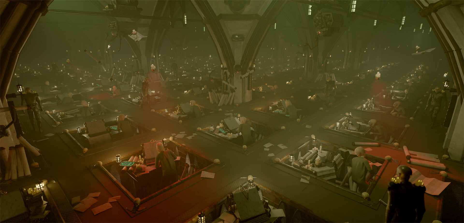
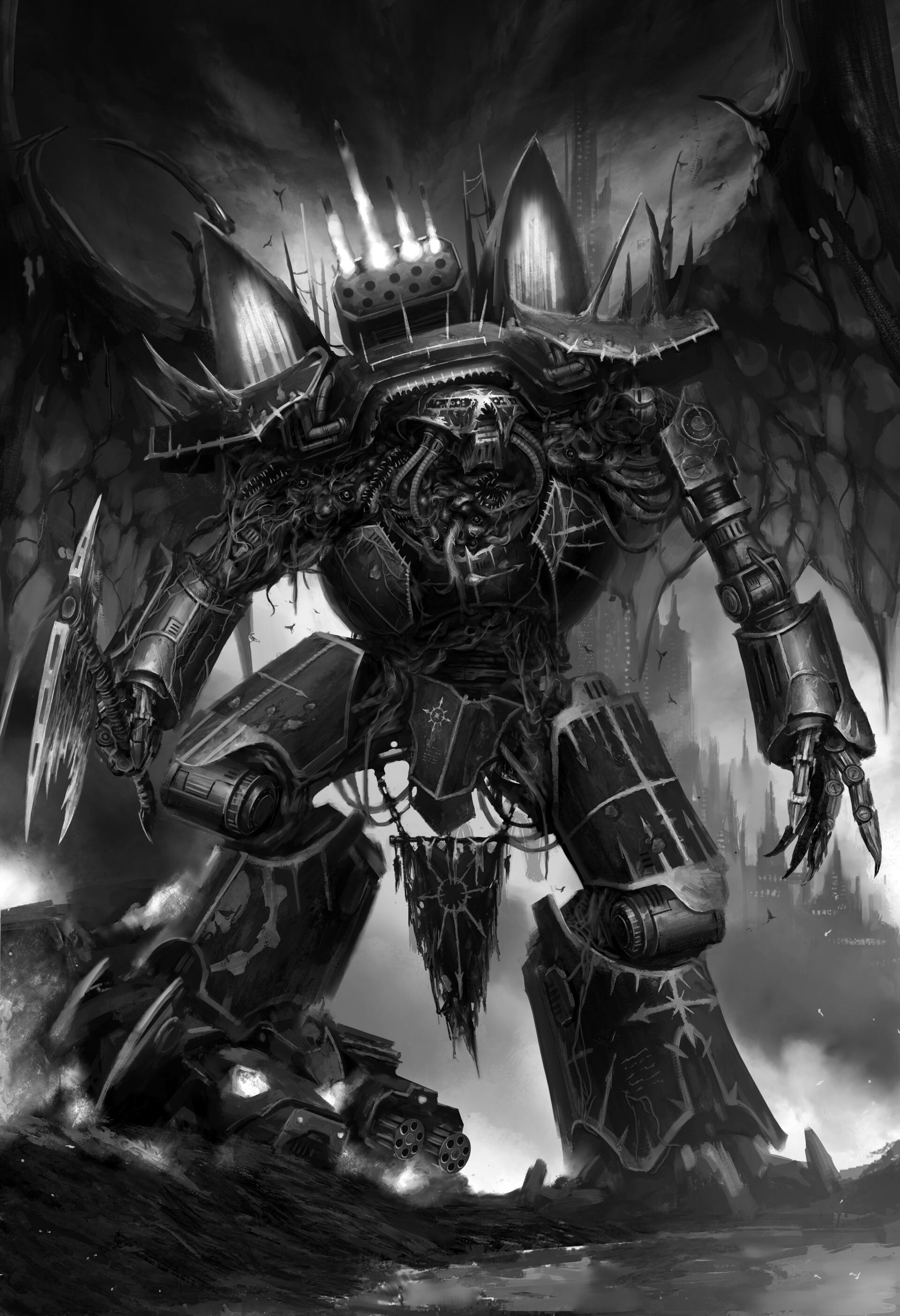
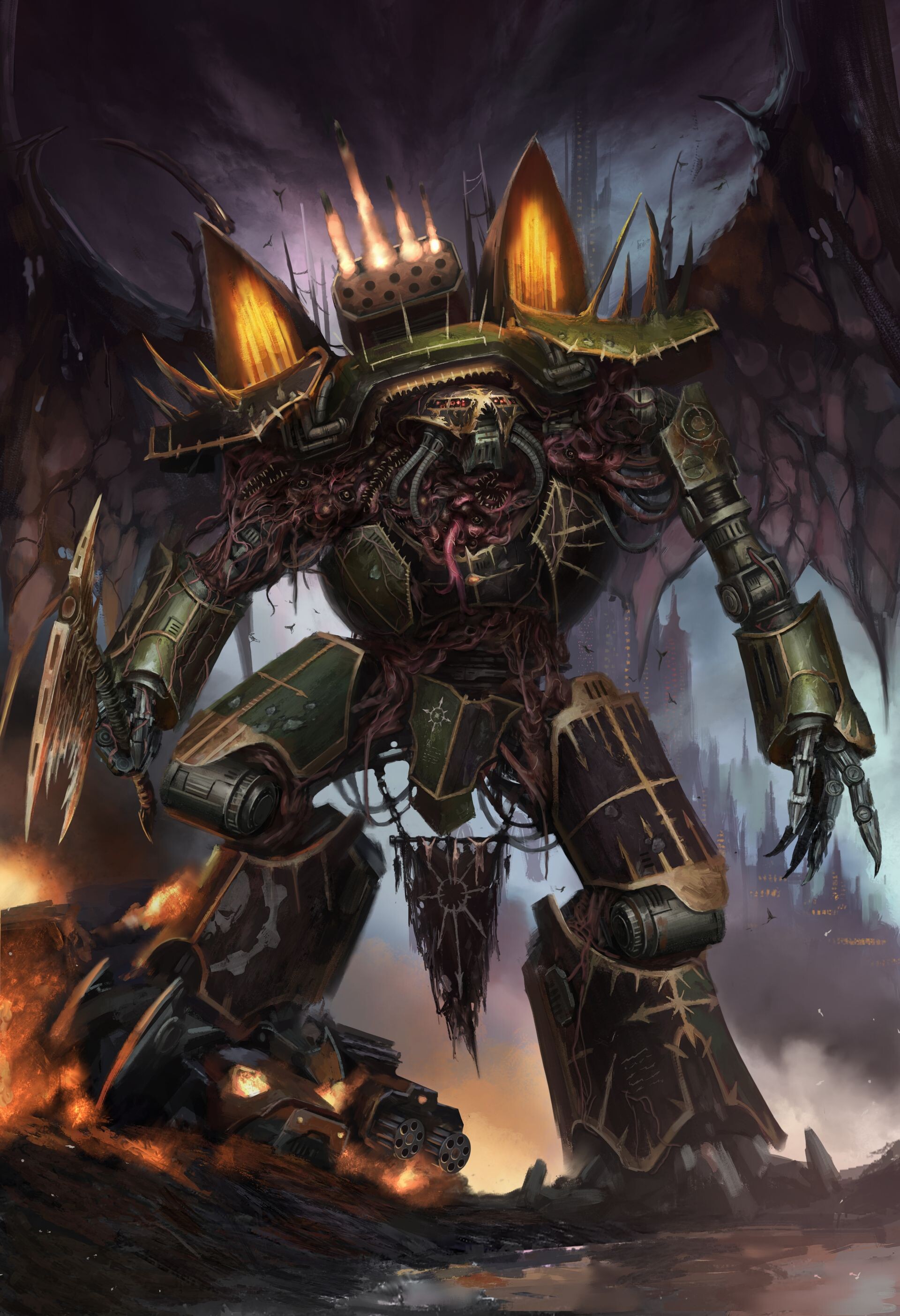
Last year I got to be part of the visual development of Cubicle 7 new Warhammer 40k TTRPG Imperium Maledictum. The goal was to infuse the visual style of the 40k universe with the gritty and gloomy feel of noir.
It was quite fun to explore spaces and themes that aren't always very visible in 40k media. Tim Huckelbery was of great help. Good times


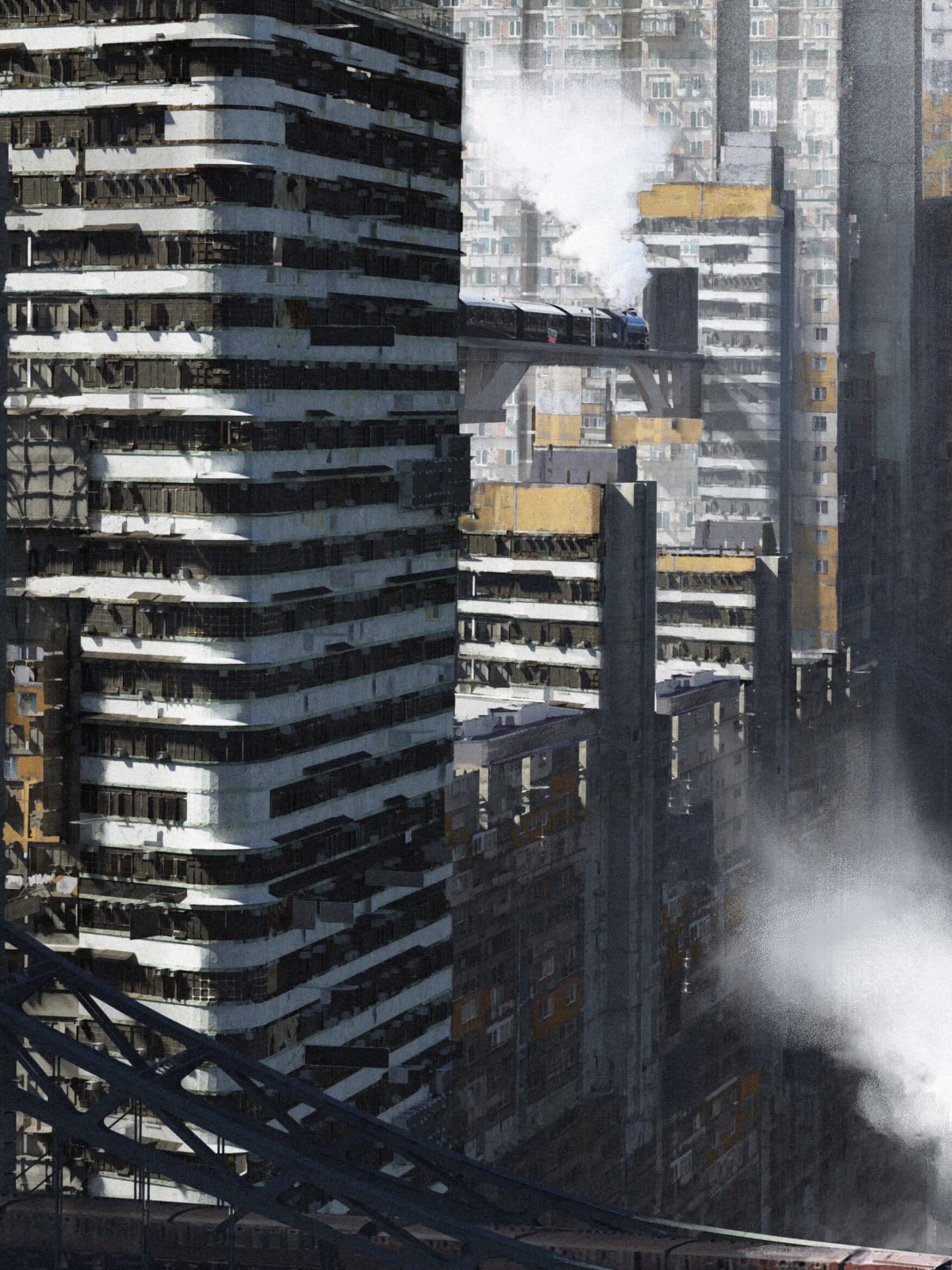
honestly american diesel/electric trains look so weird, but particularly cab-centre ones
wikipedia says "painted for a 1949 calendar", but i've found an image of it used on a calendar that says 1935/6:

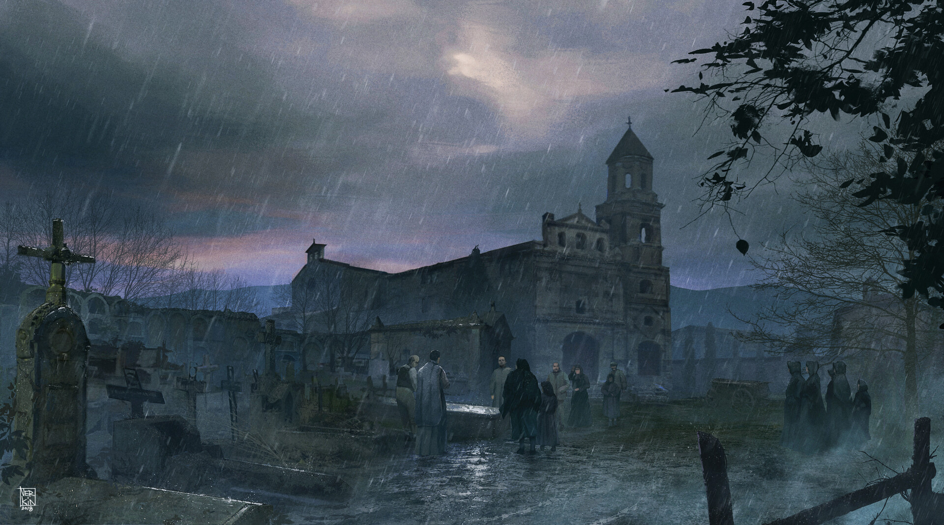
time for something a little less grandiose -- a cute little chapel
Concept of Lord Drachenfells carrige from Warhammer Fantasy universe.
(not that i know that much about warhammer fantasy. but more carriages should have this many skulls on them)

another image that i'm not certain is a portal[^1] (it could just be a mirror or something), but it looks like a portal so i'm posting it
cover art to asimov's "the stars, like dust", as well as paul anderson's "guardians of time"
[^1]: i'm not very good at this, clearly - i'm just sharing art i think is cool

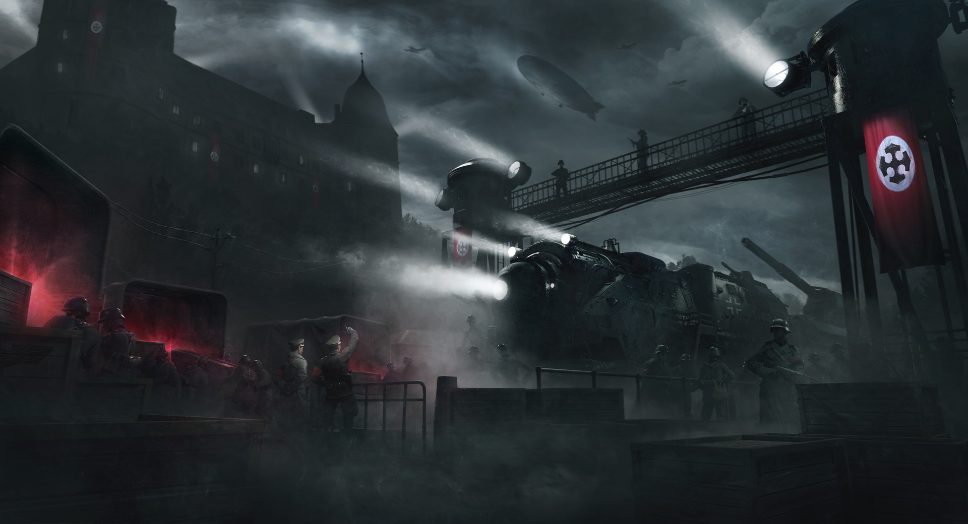
part of his "reich busters" series on his artstation (eventually that whole series is going to end up posted here, i imagine)
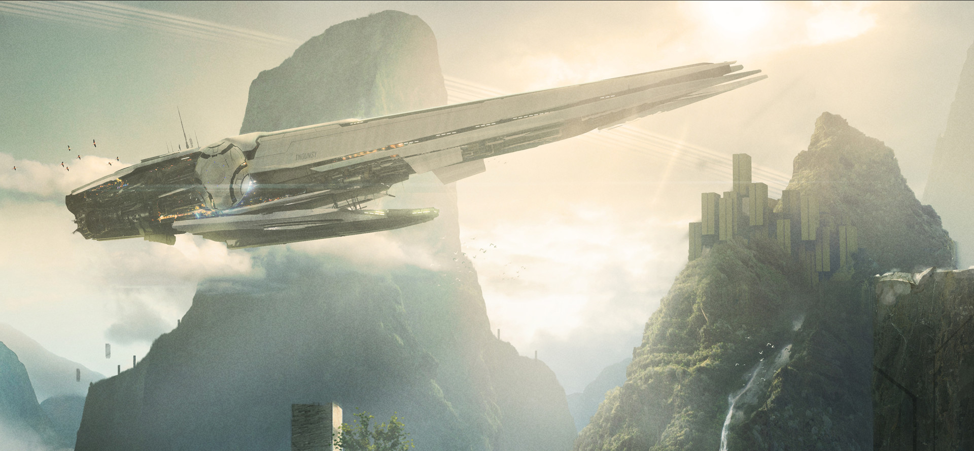
something a bit more conventional, i think
Practice between assignments
where.. where do the crew go? do they have to climb around all the viscera every time they need to do maintenance?
the actual flagship image is the greyscale version; but i like the colour version much better
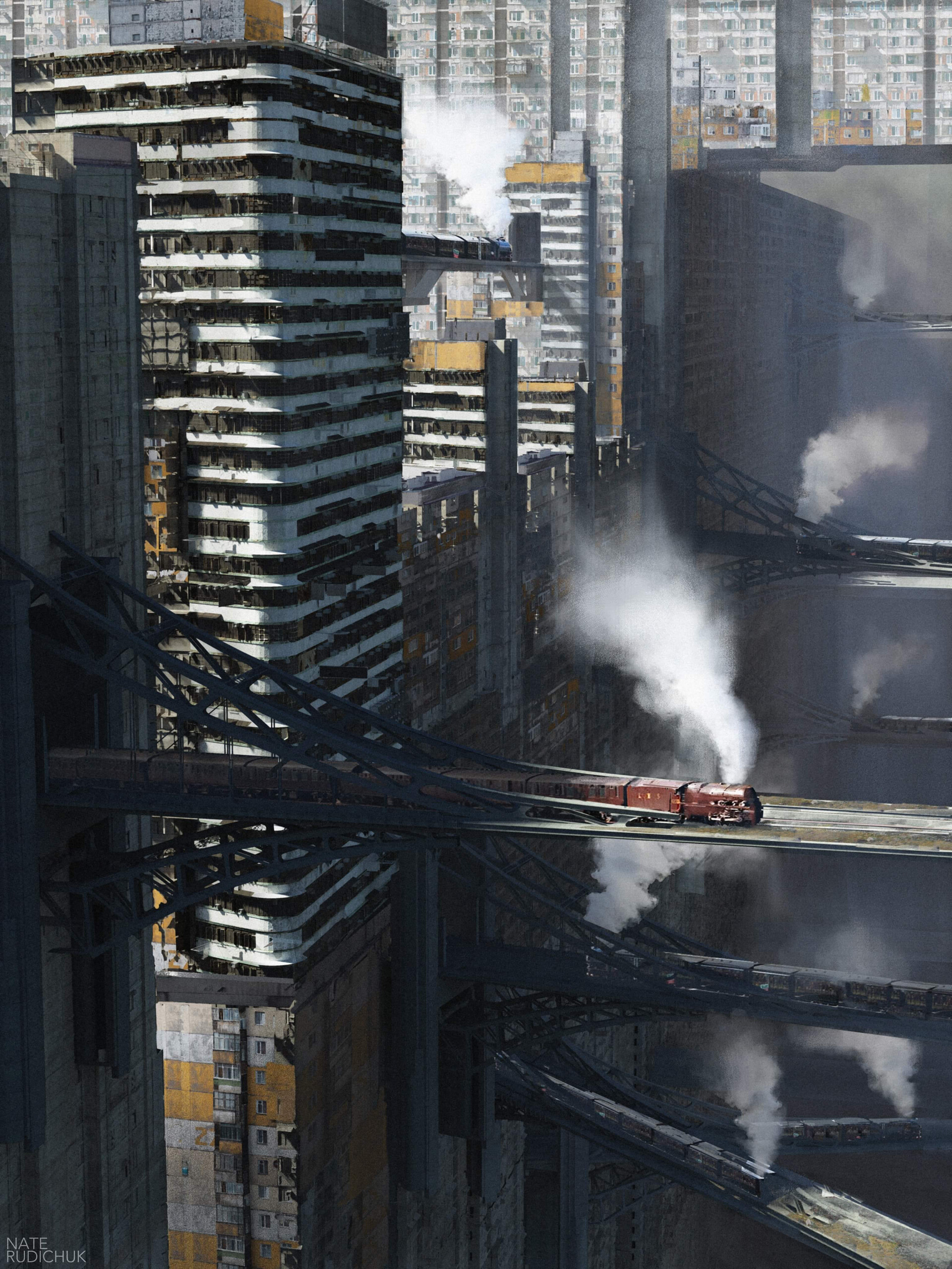
i know the train is a physically minor part of the image; but wow does it set the composition. the stubby little locos are so cute, too. i'm not entirely sure whether i see this as utopian or dystopian: it's nice to have good public transit, but boy does that place look overpopulated. i love the sheer number of smaller distant trains though
some detail views:

artstation site || artstation page
artist's [dead] website || substack
my own! gruvbox themes