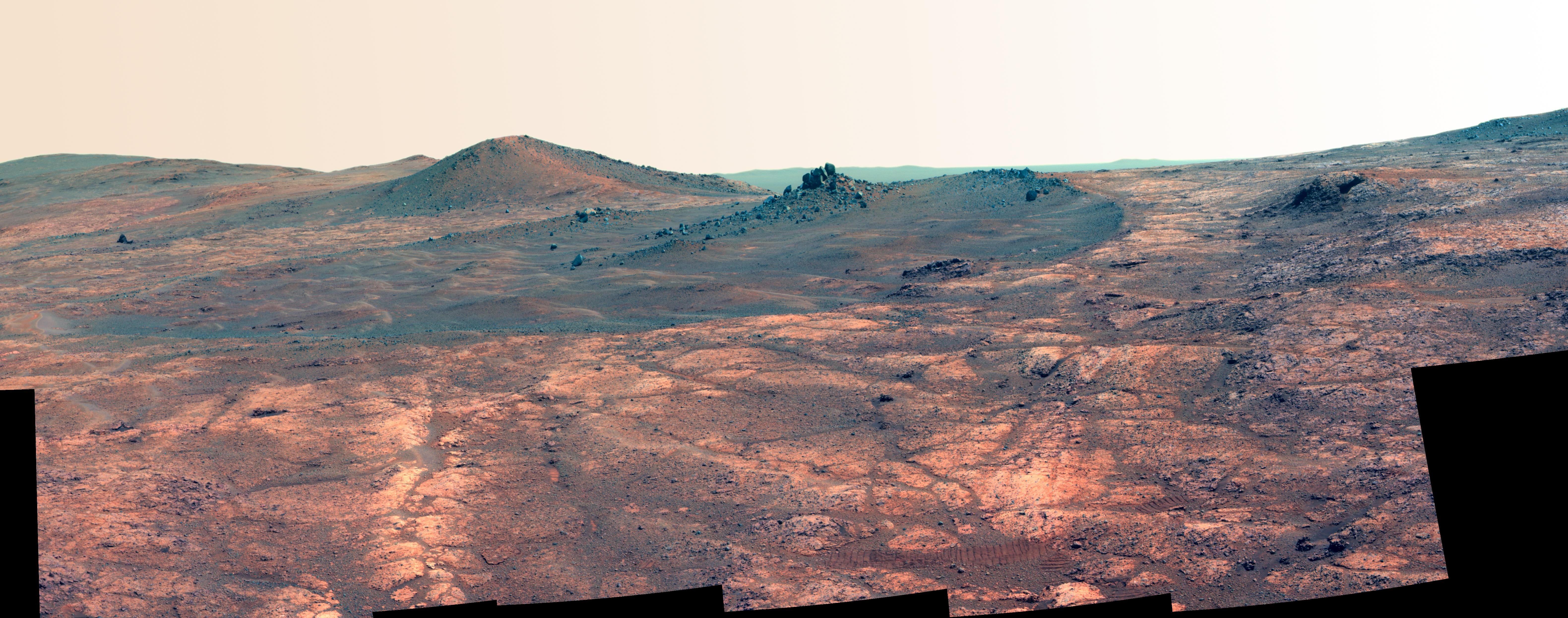
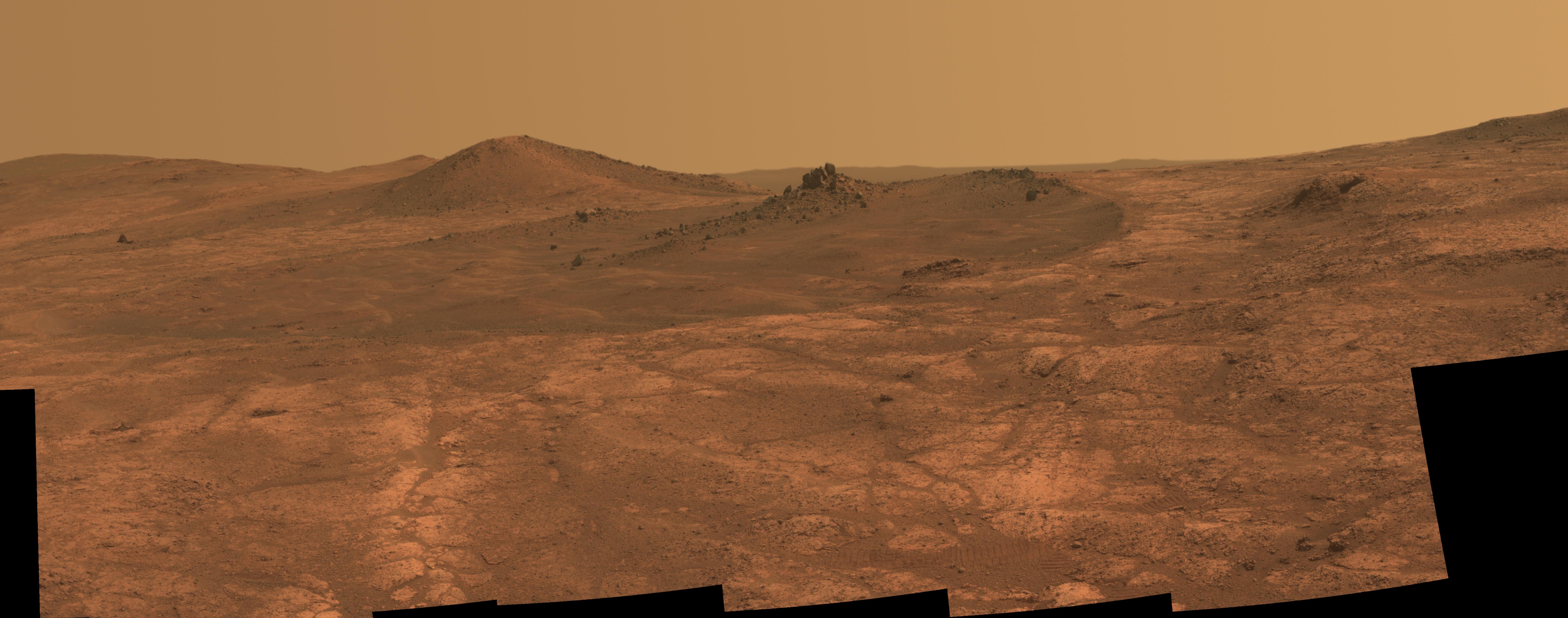
Two images of the Nili Plateau landscape to the west of the rover: one taken at about 1:30 PM local time, the other at about 7 PM, in early summer.
The evening shadows really give the landscape a definition and intrigue which the hazy afternoon sun barely hints at, with even small pebbles standing out, and those sandy mega-ripples down below much more easily identified in the distance.
OTOH, I find that the rover tracks (on the right) become harder to see in the evening, so your hiking skills and common sense are key on late-day excursions. You definitely don't want to be lost in this landscape after dark as temperatures quickly head for -100 ºC...


I'm as far from being an artist as you can get, but I like what you and supersquirrel are aiming at. As you know, I've been thinking about data visualization and presentation for these missions a fair bit recently. Personally, I find natural color images like this one from the curvilinear unit plenty spectacular and readable as is, but in general, a lot more work needs to be done to convey these missions to people.
If I've learned anything from supersquirrel's point, it's that we need to show multiple perspectives on the landscapes these rovers see. The missions have a natural tendency to do most of their imaging during the middle of the day, but that hazy dusty mid-day illumination is nothing like the sharp lighting that morning and evening shadows bring to the landscape. At the same time, I'm always worried about data/visual overload in these situations...