I see what you mean about anti-capitalist art.
This is a friendly community for everyone who wants to share their art with the world! Everyone is welcomed 🎨
Please visit https://lemmy.world/c/artmarket as well! This is a community for artists to post their portfolios and announce availability to take commissions, as well as get visibility for Ko-fi, Patreon, and other funding for art activities.
Rules
AI Art: While we appreciate AI generated art, there are more appropriate communities to post that type of art to. Please keep posts to non-AI generated art only. This rule includes AI art that was then manually manipulated (e.g. drawing on top of something generated by AI).
Nudity: Nudity is and has always been a part of art, but it may be something that some users don't wish to see or cannot view in certain circumstances (e.g. at work). If your work contains nudity, please mark it as NSFW. Work that contains nudity that is not marked as NSFW will be taken down. As long as the NSFW tag is used, we welcome nude subject matter.
Spam: Please do not spam this community. Self promotion is fine if you just want people to be aware of your work, but blatant attempts at spam will result in the past being removed and possibly a ban. If you aren't sure if what you are posting is spam, please contact the moderator first.
Conduct: Be nice, and don't be a jerk. Constructive criticism is OK, but don't be mean. Encouragement is always welcomed.
I see what you mean about anti-capitalist art.
😁
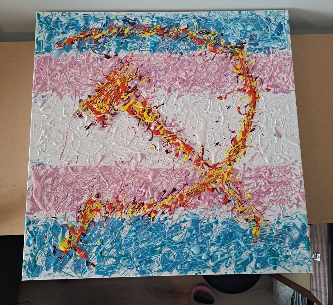
I think I get the idea, but I'm not sure the execution speaks to me. The messy paint effect doesn't feel like it adds as much as with some of the previous ones, and the two obvious visual elements here feel like they could be better integrated in some way (but obviously, whether to care what I think is your choice. Sometimes we just make stuff for the sake of making it, and thats okay)
I look forward to seeing more works :)
Thank you for the criticism! I know exactly what you mean, the two elements dont blend together near as well as I envisioned in my mind, i think the need to keep the flag "readable" really detracts from the messy paint splater effect of both it and the hammer & sickle. I was running out of both paint and medium while making this one so that definitely helps me excuse my poor execution. As much as I love the splater style and abstract expressionism I think I will be going back to landscapes once I can afford more art supplies.