14
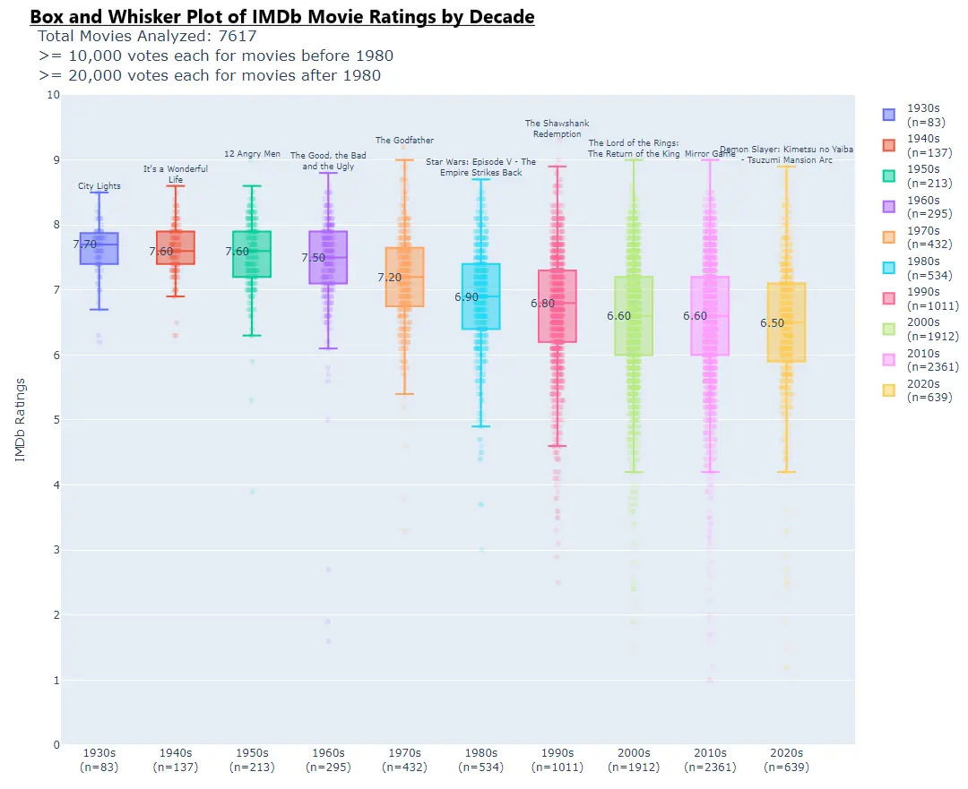
Ever wondered which decades of movies have the highest average IMDB rating? [Part 6]
(lemmit.online)
A place to share and discuss data visualizations. #dataviz
I don't like the horizontal bar graphs (or I guess rather plot points) running along the box and whiskers. They don't have units and don't really help convey much of anything that the box and whiskers didn't already convey. Yes, they are more granular, but that granularity isn't all that useful.