201
Near The Hague Central Station
A place to share your abstract photos. Please mark your own photos [OC]
Also check out my other communities Collage Printmaking Artist Lounge
Rules
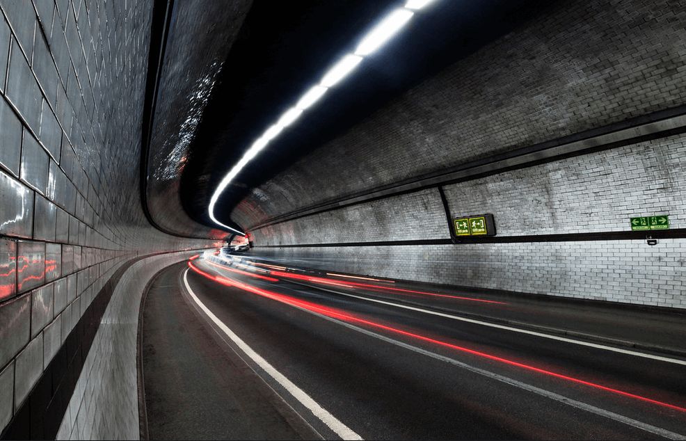
'The Rotherhithe' by Chris
Bit of a London "commuting on foot" fail today. Didn't realise that the 'short' walk from Canada Dock to Tobacco Dock involved dicing through 1.5km of the Rotherhithe Tunnel
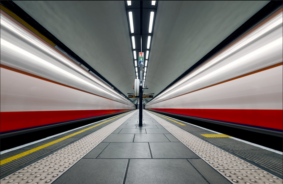
'Velocity' by Otto Berkley
Clapham Common Underground Station has the virtue of being one of London's few remaining island-platform stations, with trains travelling in both directions on both sides of a single platform. Standing between two moving trains can be an alarming but exhilarating experience, and it was this sense of energy and propulsion that I was hoping to convey in this image.
Besides the challenge of capturing two trains crossing through the station at the same time and at the same speed, the challenges to realising the image were capturing a busy platform when it was empty, having a high level of control and balance when editing individual portions of the platform, and the fact that an extended shutter speed to capture blurred trains was inevitably going to blow out highlights from the station's overhead lighting. With all of this in mind, the final product was edited by blending several separate exposures.
I began by capturing the platform empty a few minutes after the station opened in the morning, later using luminosity masks in Photoshop to blend multiple exposures for a balanced finish. I then continued photographing for over an hour, capturing trains at various shutter speeds as they pulled into and out of the station, eventually settling on three- and four-second shutter speeds to blur the trains. At the editing stage, I used the pen-tool to select the two tracks on the platform and masked in the trains which I'd captured travelling at similar speeds and with near-identical levels of luminance and saturation.
The challenge after that was restoring the rich reds of the train doors and the blues along the carriage undersides, as the speed at which the trains were travelling blended these into a blurry magenta, meaning both trains needed additional colour-grading in order to restore their primary colours. Having the trains on separate layers was a benefit as it meant I could edit the trains and the platform independently, bringing out the subtle grit and cooler muted tones along the platform without affecting the smooth and vibrant motion of the trains. For me, this contrast between the detail in the platform and the dizzying blur of the trains is what gives the image its impact, and hopefully what evokes a sense of what it's like to be standing on a platform between two moving trains.
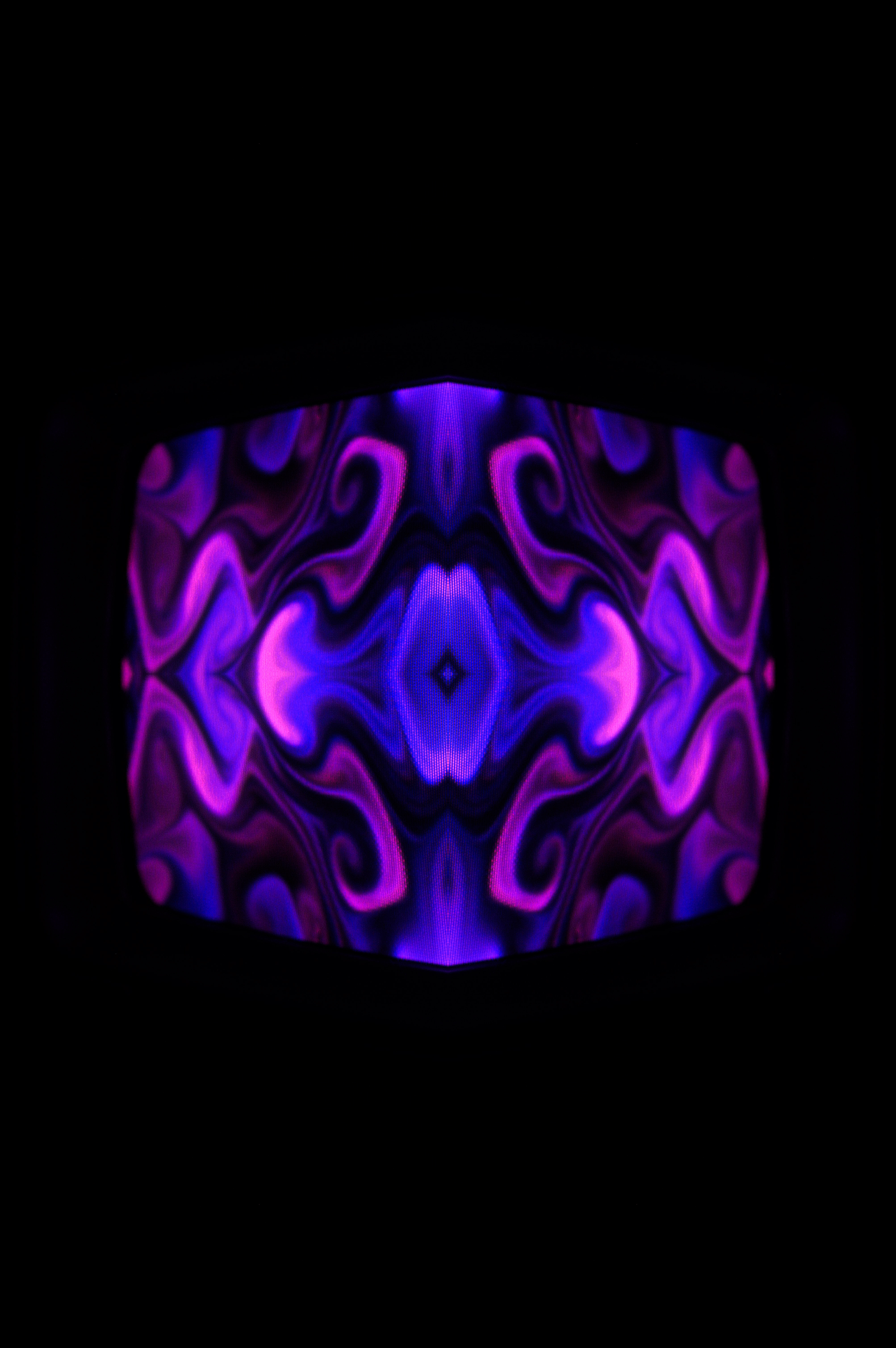


Some bonus ones from this last group I did for a project of mine. These are taken on a small magnavox crt tv connected to my computer. Shot with a Nikon D3200 with 50mm 1.8 and mirrored in select ways


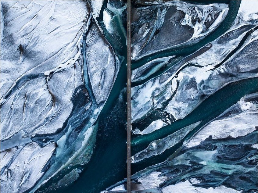
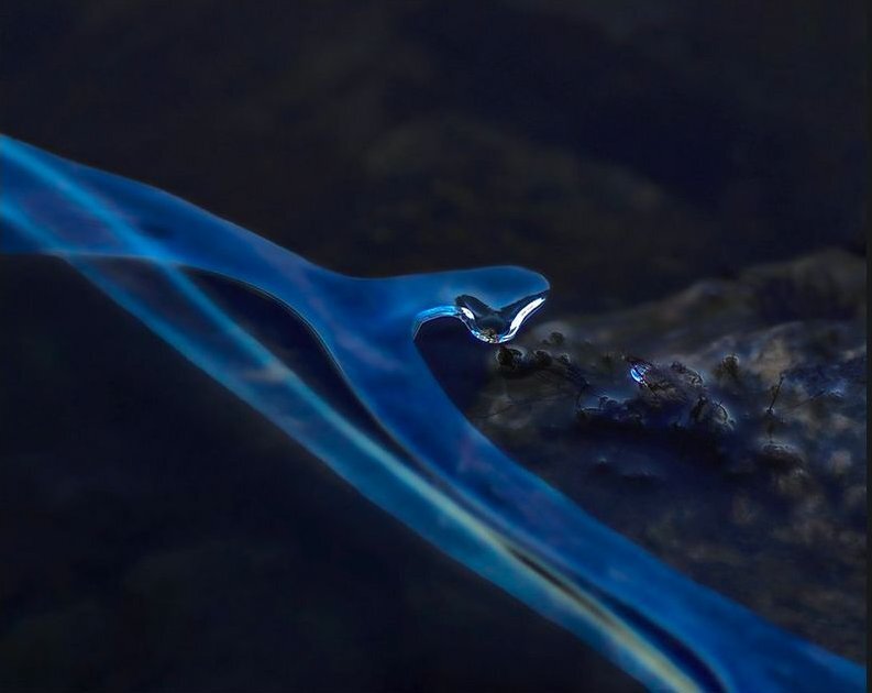
After several weeks with the most beautiful winter weather it changed to rain and heavy wind again. The ice melted, making wonderful images in the process. This is very close to the ice edge, and I didn't notice the head of a snake until I started working with my shots of the day. I like it a lot, and I am aware of the fact that not everyone will actually see a snake. That's the great thing about abstract images: what you see is what you get (WYSIWYG). Try it!
Found on flickr
A set of colorful, abstract wallpapers I made myself. They are all based on a glued on rainbow-foil on my balcony window.
My repo for downloads and more, including the raw files.
They're all free to modify and use.
Samples:


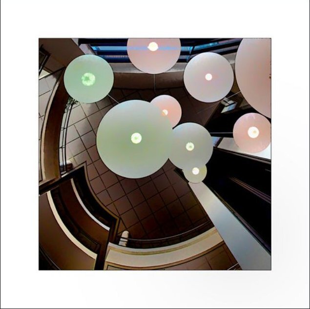
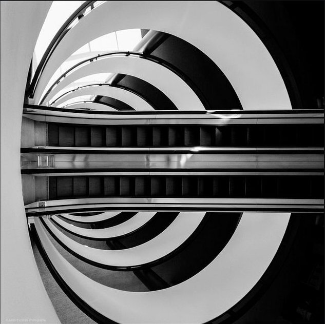
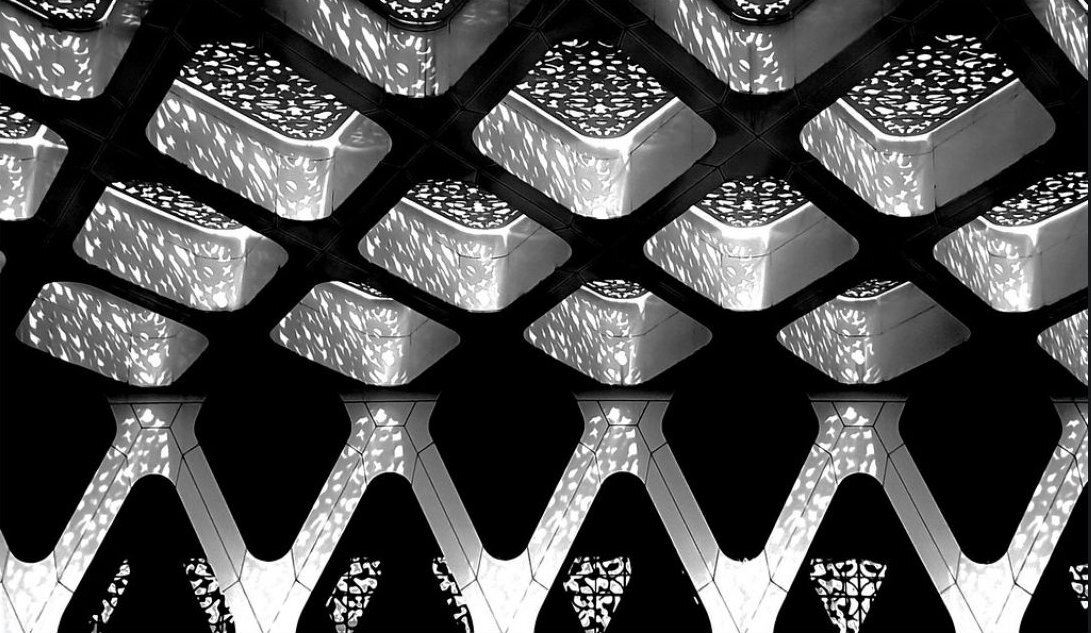
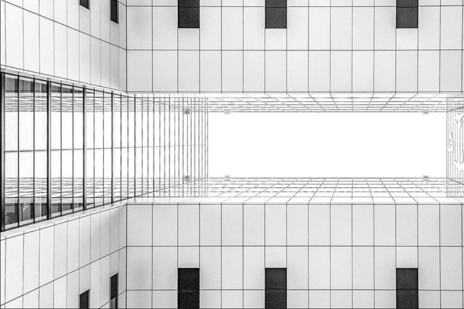
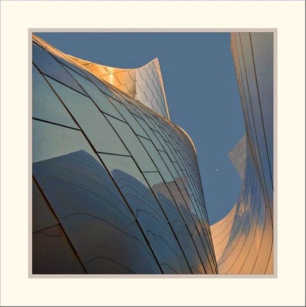
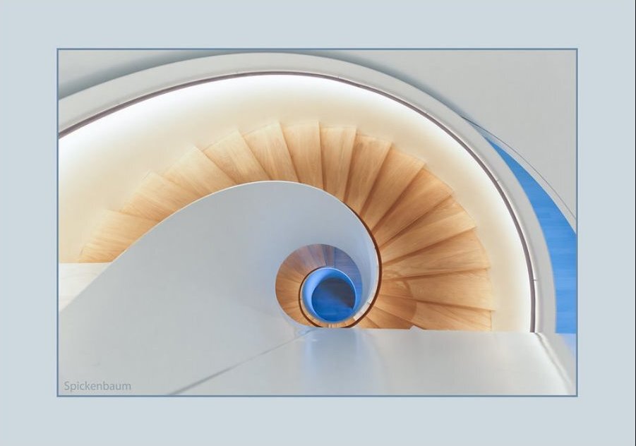
'The architect's design and the model of lighting fit my series L&P: surprising compositions in the everyday, a special view of buildings, interiors ... lines made abstract.
There is more of this series at Lines and planes'
More on flickr